COVID 19
DATA EXPLORATION
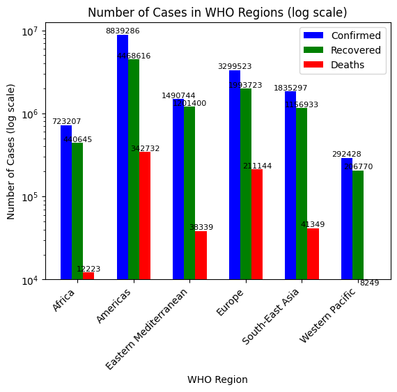
In this project we use SQL Server to explore global COVID 19 data. Performed data cleaning and data exploration using SQL, created insights for visualization.

Data Analyst well versed in SQL, Excel, Python, Tableau, Power BI@HardikTheAnalyst
In this project we use SQL Server to explore global COVID 19 data. Performed data cleaning and data exploration using SQL, created insights for visualization.
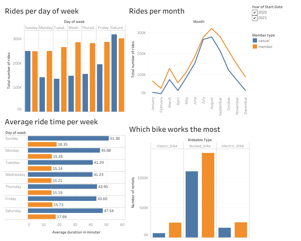
I utilized SQL and Python to address the imbalanced dataset and performed data cleaning. By leveraging information on rides per month, per year, and per day, I generated visualizations using Tableau. This aided the organization in enhancing sales and encouraged the conversion of regular members into casual members.
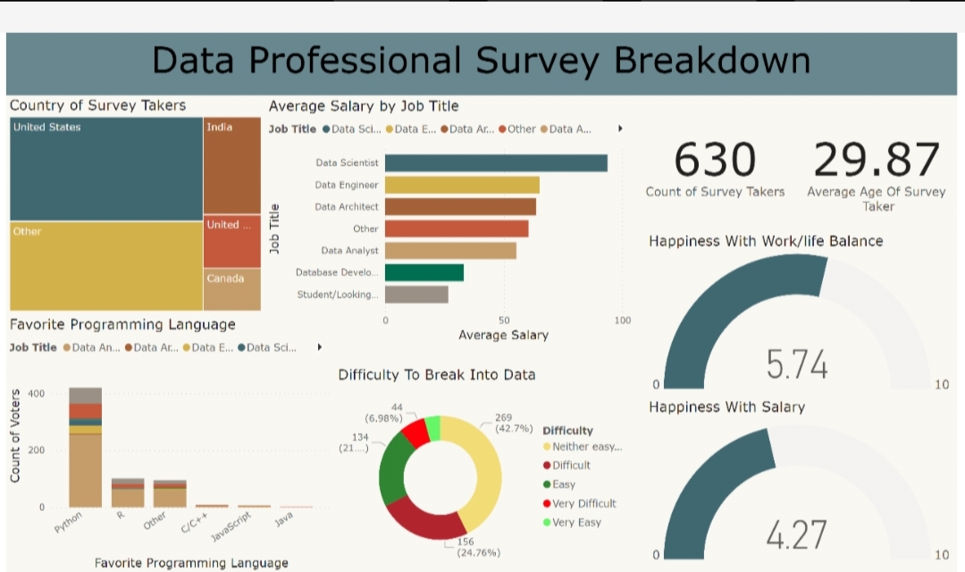
I have conducted data analysis and visualization, creating dashboards using tools such as Excel, Power Query, and Power BI. I delved into data roles to uncover trends, visualizing information such as average salary, data roles per county, total survey results, and happiness with work/life and salary. Tool Used:: Excel, Power Query, Power B
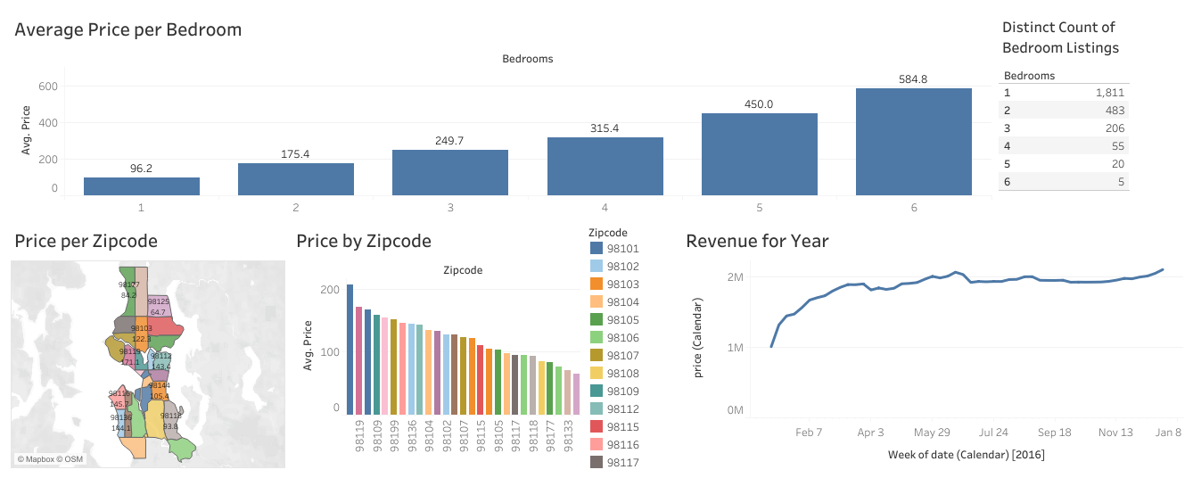
Using Excel, Tableau, and Kaggle datasets, I conducted data visualization for Airbnb. Analysis included peak business times, zipcode-based pricing trends, yearly revenue, average bedroom prices, and bedroom listings count. Visual representations revealed peak periods, pricing strategies, revenue trends, and market insights. This project informs strategic decisions, enhancing Airbnb's market standing.
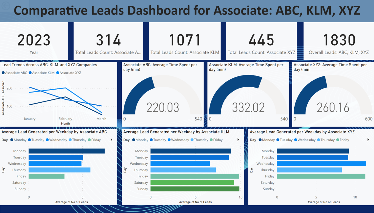
Performing a thorough analysis of associates ABC, KLM, and XYZ, I utilized Excel and SQL to derive essential KPIs like Average Leads Generated/day. Power BI aided in crafting impactful line charts illustrating performance trends. Synthesizing data-driven recommendations, a concise two-page PDF report was created, meeting company specifications. The report not only highlighted significant performance trends but also offered actionable suggestions for enhancing associate performance
Engaged in a comprehensive COVID-19 analysis using Python, Pandas, and NumPy in Jupyter Notebook. Rigorously cleaned data, crafted impactful visualizations with Matplotlib, and derived key KPIs. Uncovered insights, including global trends, CFR, Recovery Rate, and identified regions with the highest active cases percentage and average metrics.